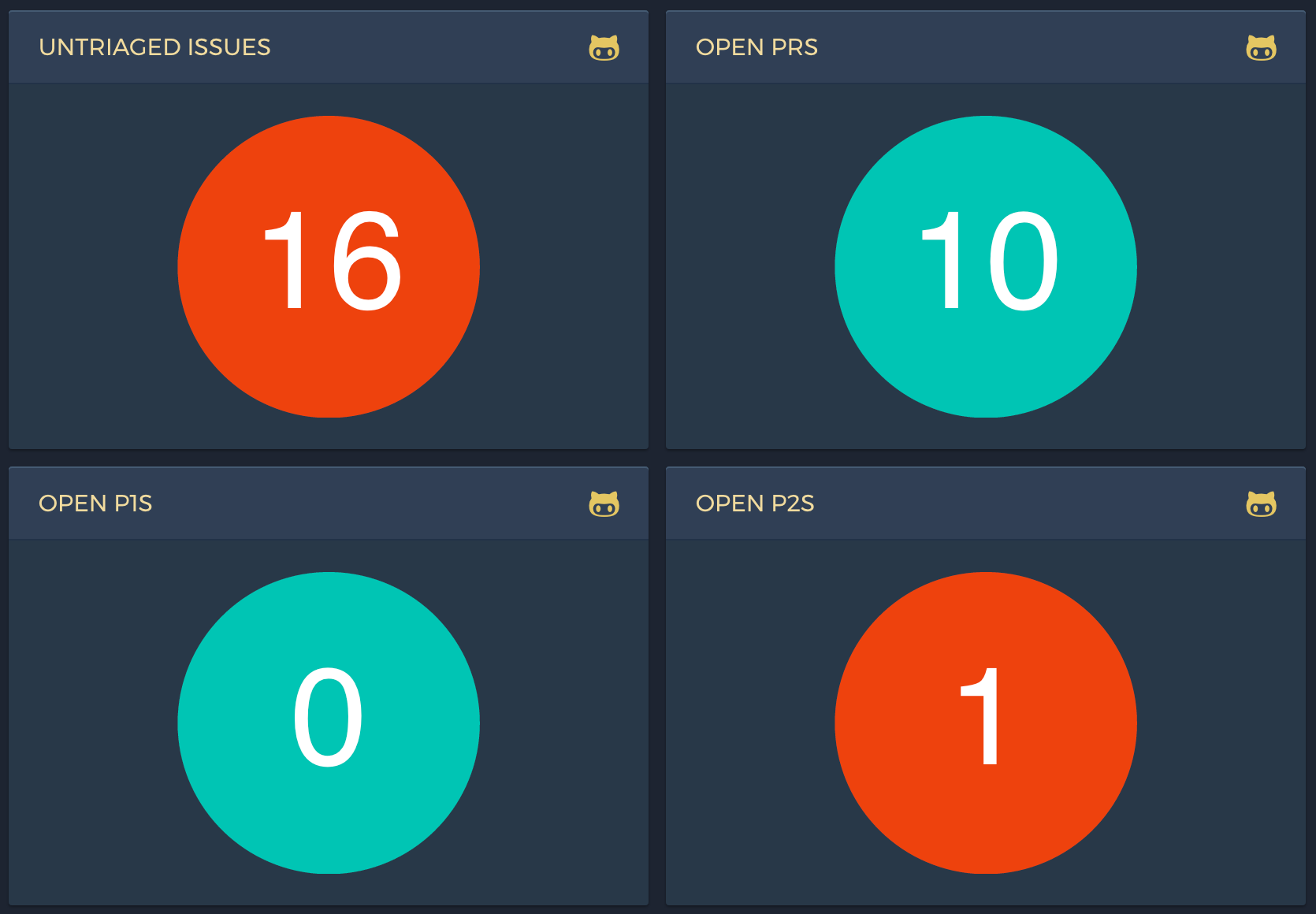
Recently in building out a dashboard to show the number of github issues for a given search, I wanted to show a circle containing a count.
When we think about responsiveness in web pages we mostly think about making things that respond to a horizonal constraint. However, for a dashboard, because it fills the viewport, being able to adapt the size of the circle both horizontally and vertically is important.
A goto solution for allowing resizing but maintaining aspect ratios is to use padding with a percentage value. Using a percentage makes the padding relative to the width of the parent.
The problem with using this for our circle is that it won't resize when constrained vertically.
svg to the rescue
Fortunately svg provides a great solution to this problem, we can draw a circle with SVG and this will be resizable both vertically and horizontally.
Here's the svg source:
<div class="outer">
  <svg viewBox="0 0 140 140" preserveAspectRatio="xMinYMin meet">
    <g>
      <circle r="50%" cx="50%" cy="50%" class="circle-back" />
      <text x="50%" y="50%" text-anchor="middle" dy="0.3em">42</text>
    </g>
  </svg>
</div>
It's worth noting the dy which attribute is used to "fix" the vertical centering of the text.
The dy attribute indicates a shift along the y-axis on the position of an element or its content. What exactly is shifted depends on the element for which this attribute is set.
This method was found in this article by Lea Verou:
Easily center text vertically, with SVG!
And the css:
.outer {
  align-items: center;
  border: 1px solid #ccc;
  display: flex;
  height: 500px;
  justify-content: center;
  max-width: 100%;
  overflow: auto;
  padding: 50px;
  resize:both;
}

svg {
  height: 100%;
}

circle {
  fill: #3DB8A4;
}

text {
  fill: #fff;
  font-size: 4rem;
  font-family: sans-serif;
}
Demo
Resize the box vertically and horizontally:
The end result
And here's what it looks like in our dashboard: