CSS Drop Column Layout | Comments (35)
Posted in CSS on 7th February 2006, 12:05 am by Stuart
Simon Collison posted an article about his new fixed width 3-column layout which is made possible with a dash of javascript to alter the layout based on the resolution of the client’s window. For more on Simon’s layout see this post. Tim referred to my site in the comments on Collylogic saying that my site covered the same functionality without requiring javascript. So this post is a more detailed explanation on how my layout works.
When I created this site I wanted to have 4 columns which are all fixed width. The idea was that if you resized the window then the columns would drop down when there wasn’t enough room. To explain in greater detail here is a visual:

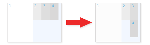
To achieve the desired effect I am using floats. A natural property of a floated element is to drop down when there isn’t enough room until there is enough space. This means that the column on the furthest right will drop when the window is re-sized. One of the issues with this would be if the primary content column was not high enough the displaced column would wrap underneath it. To combat this undesired effect I have used a wrapper with a left margin to ‘hold’ the 3 smaller columns to the right of the primary content.
Limitations
There are a couple of limitations with this technique. The 4th (quaternary) column will drop underneath the 2nd (secondary) column if the 2nd (secondary) column is the same height or less tall than the 3rd (Tertiary) column.
A min-width was set on the body so that a horizontal scroll-bar will appear if the window is resized below 770px. This doesn’t work in IE and neither does the proprietary expression.
The demos
The following demos are grossly over simplified but give you an idea of how this layout works.
Update: Richard Rutter has written up a concise round up of related layouts in response to Colly’s original post.

It does work really well – especially in terms of four columns. A perfect use for floats, and the kind of thing that normally happens when I don’t want it to happen!
As I said before, it’s just a shame that IE sucks so badly. I do like the definite cut-off point that I can assign with JavaScript, but I’ll still bookmark your layout!
Yep, I like this a lot. It just works – no fuss, and is the kind of thing that makes use of floats for the right reason.
And just think, I’ve visited here enough times and never noticed it! It just works.
@Colly and Andy: Thanks for the positive comments. A useful discussion came out of Colly’s original post which spurred me on to finally writing up this layout properly, which was about time!
What can I say? Impressive work, I do really like it.
That’s definitely an intriguing interpretation of "helping your visitors to view your site the best way they can". Thumbs up!
I’m gonna bookmark this one for sure.
This is infact what I’ve used for ZachInglis since version 3.0
Here is the code to have a min-max work in IE. Hope it helps!
(put in head)
@Jonathan: Expressions as a prop for min-width work well most of the time but in the case of the floated columns it fails miserably. Interesting the conditional for quirks/standards mode though, I hadn’t seen that before.
Very nicely done. There seems to be more and more techniques coming out to give CSS layouts more flexibility. It’s a pity that IE6 holds some of them back.
Great article.
It could be done with CSS3 media queries:
@media screen and (max-width: 1000px) { Some CSS here }
@media screen and (min-width: 1000px) { Some CSS here }
But it only works in Opera for now, and the changes aren’t dynamic (but it might be Opera’s issue).
This looks pretty cool but it could get annoying with long secondary, etc content.
Good work.
@Szymon: I don’t see any issue in Opera’s support for min-width in any case.
@Nick: Yes you are right, particularly for anyone with their browser open at 800×600.
Great big thing for the Web 2.0 – Thanx
In my IE it still doesn’t work correct
@Konrad: Can you be a bit more specific? What exactly isn’t working and what version of IE are you using?
Nice work, I am going to play with it now.
nice i’ll try that one…
[...] Quick read about how to achieve a drop-column layout without using JavaScript. Link [...]
I don’t see the point if it doesn’t work in IE. Is there a better way to do this without excluding 90% of browsers?
@Shops: If you had taken the time to try the examples, you would see that they do work in IE. It’s just that trying to make a scroll-bar appear for when the screen is re-sized below 770px that doesn’t work nicely.
[...] Muffin Research – CSS Drop Column Layout (Bsp. ansehen) [...]
[...] CSS Drop Column Layout [...]
[...] Hope dawned when I stumbled over the idea for dropping columns at Muffin Research Labs, a CSS solution that would allow sidebar elements to sit side by side when enough space’s available and otherwise just drop neatly into one column otherwise.1 [...]
Stuart, thank you very much for this layout, I really like to use it. But i would like so have the first (main) column to be centered, an the other columns float as they do know. Is this possible?
Thanks from Germany
Julius
@kwurzel: Here’s a quick attempt at that using some cheeky offsetting with negative margins and padding to make it work.
http://muffinresearch.co.uk/code/xhtmlandcss/dropcolumn/julius/
Briefly checked in moz, safari, opera and IE6
[...] CSS Drop Column Layout [...]
thx for sharing. the right solution for my site
hope i can do it
Is there a way to have all the n-dary columns slip to the bottom if the page width collapses to just the primary column? Just thinking about certain mobile layouts…
Thanks for this, Stuart – a great solution.
Stuart, great work, planning on using this on my next project (suitably disguised so I can pretend I’m a CSS god, of course
. Was trying to get a centered effect for the whole thing, any suggestions? I saw your solution for Julius so it looks like it should be possible but it’s defeating me!
Nevermind, I managed it using Colly’s javascript to adjust the width on a centered container div. Great stuff!
[...] CSS Drop Column Layout by Stuart Colville (tags: css html) [...]
[...] CSS Drop Column LayoutWhen I created this site I wanted to have 4 columns which are all fixed width. The idea was that if you resized the window then the columns would drop down when there wasn’t enough room. [...]
wow, very nice,
i dont want to use table in web layout so
i try and try to get like this css, right now ok.
hi stuart,
this is exactly what i’m looking for.
any possiblity to download this wordpress template?
greetings from munich,
juergen
[...] CSS Drop Column Layout – Stuart Colvilles [...]
[...] The concept isn’t difficult, and many developers have made their own version of this technique. A great source to find even more examples of adaptive content layouts and scripts is Clagnut.com’s blog post, “Variable fixed width layout“. There is even one such technique featured on this post that requires no JavaScript whatsoever: CSS Drop Column Layout. [...]